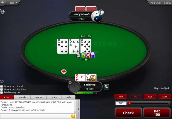
— Written by Sachin Pillai —
Hello to everyone out there! This is Sachin here again with updates on your very own portable poker bluff detector. I ended my last blog post mentioning how I developed the capability to collect electrodermal activity during full rounds of poker. This has allowed me to amass a large dataset of subjects playing poker. I am now nearing the end of my data collection/analysis phase and am close to producing a functional bluff detection method.
The past three weeks have consisted of lots of dead-ends, retracing, and fine-tuning. My initial approach to classifying bluff from neutral signals was to use the raw images of the galvanic skin responses and feed these graphs into the neural network. Just by judging these samples with my eye, I was able to somewhat distinguish between samples that contained a bluff versus those that did not. Data samples representing these two scenarios are shown below.
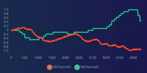
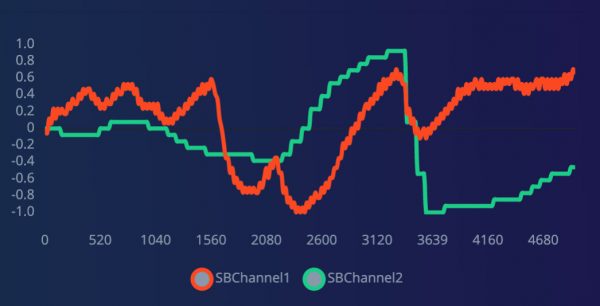
Both images represent electrodermal activity during a live poker session. Each image contains the GSR (galvanic skin response) and pulse response five seconds after either the flop, river, or turn has been uncovered. The image on the left is data collected during a neutral trial where the player was not disadvantaged by the cards on the table and did not decide to bluff. The image on the right shows when a player made a conscious decision to bluff after seeing the cards on the table. The orange line (SBChannel1) is the galvanic skin response while the green line (SB Channel 2) represents the pulse rate.
As you might notice, I was collecting two streams of data: the galvanic skin response and pulse rate. However, my experience with analyzing data samples suggested that the GSR contained much more potent signals as opposed to the pulse rate. Thus, the remainder of my data analysis was conducted with only electrodermal activity.
A looming issue I was running into was that despite my own ability to discern a bluff from a neutral response just based on raw data, the Edge Impulse model was not. In fact, classification was so horrendous that I knew I needed to change my approach. Below is an image of my classification results.
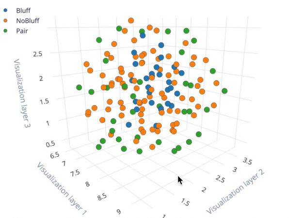
Tough luck. However, this prompted me to move into more sophisticated data analysis techniques to see if there was any way I could see an unambiguous difference between bluff and neutral signals. This became my central goal over the past week.
Over time, I developed a data analysis pipeline that consisted of a 4 Hz high pass filter, downsampling, moving average calculation, and normalization. A high pass filter is a data processing technique that only allows signals of a certain frequency or higher to pass through. For my purposes, I chose to disregard signals below 4 Hz. Downsampling is a method of lowering the sample rate of data after it has been collected so that more data can be analyzed. Moving averages and normalizations were used so that I could validly compare between data values of bluffs and neutral responses.
The results from this series of data analysis techniques are displayed below. I’ve shown the average bluff and neutral galvanic skin responses between two different poker samplings. The green line is the average of the bluff response and the red line is the average of the neutral response.
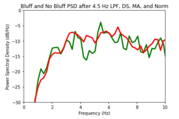
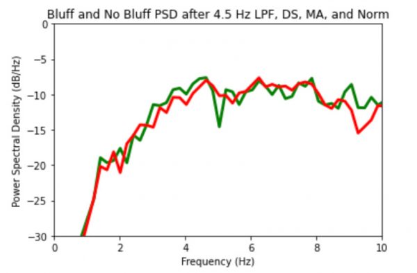
This data has given me hope that I can, in fact, detect bluffs. As seen in the 4-5 Hz range, the red and green lines suddenly deviate away from each and only return together after the 6 Hz level. For reference, a 4-5 Hz signal indicates a wavelength of 200-250 milliseconds. I was very glad to see such a difference between bluffs and neutral responses but I wanted to better visualize this change. Below are some graphs that do just that. I’ve taken the difference between both lines at each frequency and plotted it below.
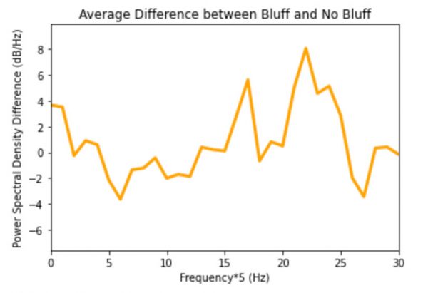
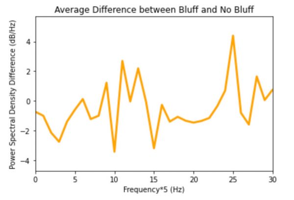
This difference plot between the green and red line shows exactly why I am so hopeful in my data. As expected, the greatest difference between the red and green lines is prevalent in the 4-5 Hz range. This signal is much more clear in these graphs, which is why I use it as visualization to show just how different the signals are from each other. Note that in the graphs, the x-axis scale is multiplied by a factor of 5 so the 4-5 Hz interval is actually represented between 20 to 25 Hz.
So I am confident we have found the needle in the haystack. However, to be completely sure of my hypothesis and for the sake of improving the accuracy of the neural network, I need to finish building an extremely large collection of data. This will be my goal for the remaining week and next week will hopefully end with the accomplishment of having a neural network that can detect between bluff and neutral responses better than chance.